Client
LOC - Loreto Open Community
Year
2022
Services
Identity - Exhibition - Motion Design
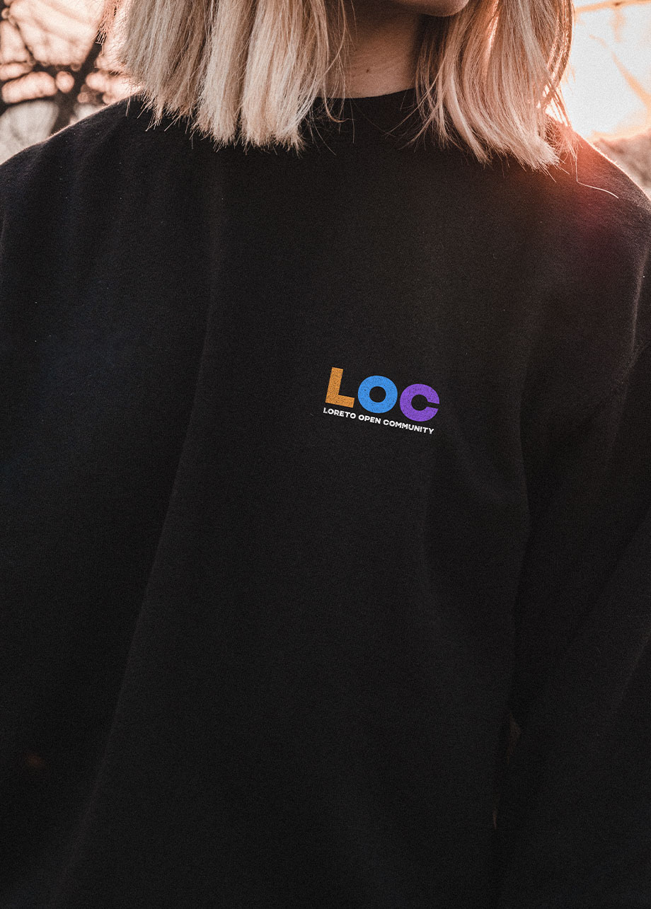
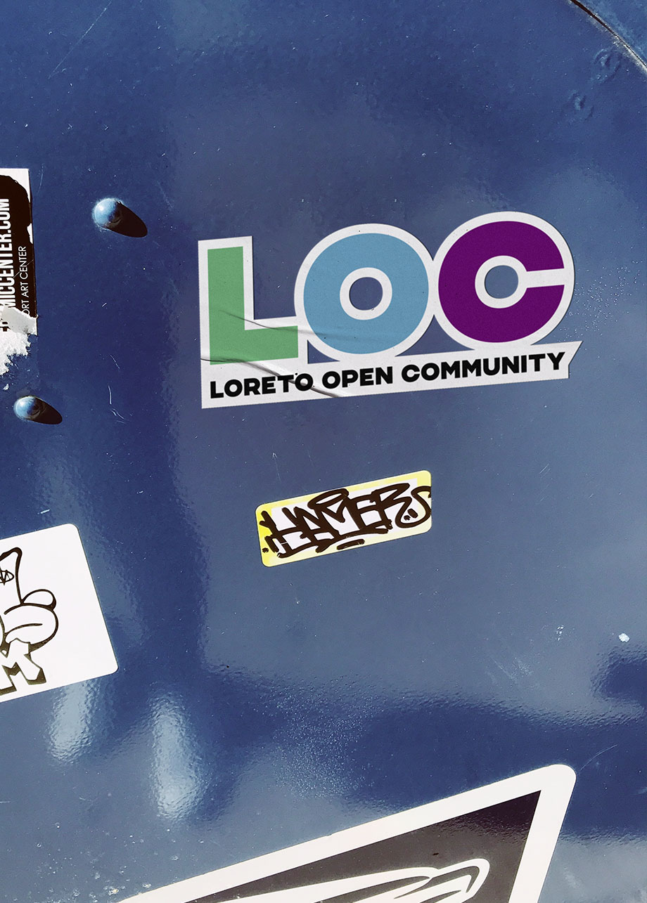
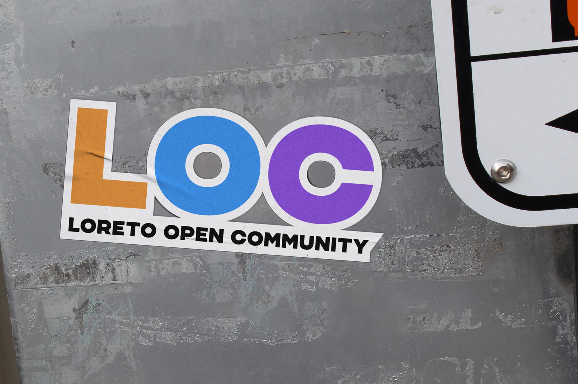
Loreto Open Community is an urban regeneration project, promoted by the city of Milan together with C40, which will transform Piazzale Loreto from a traffic junction into a green place that sets community relations in motion.
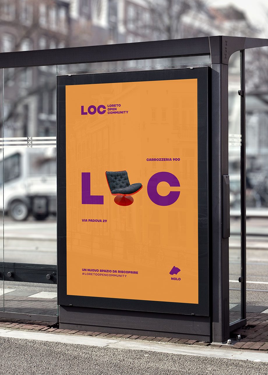
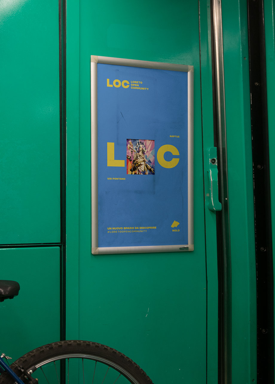
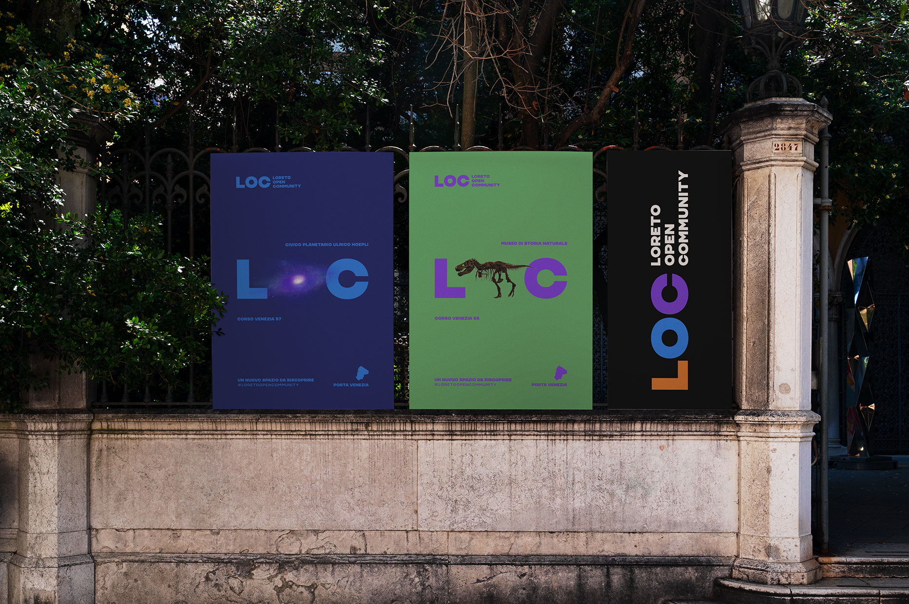
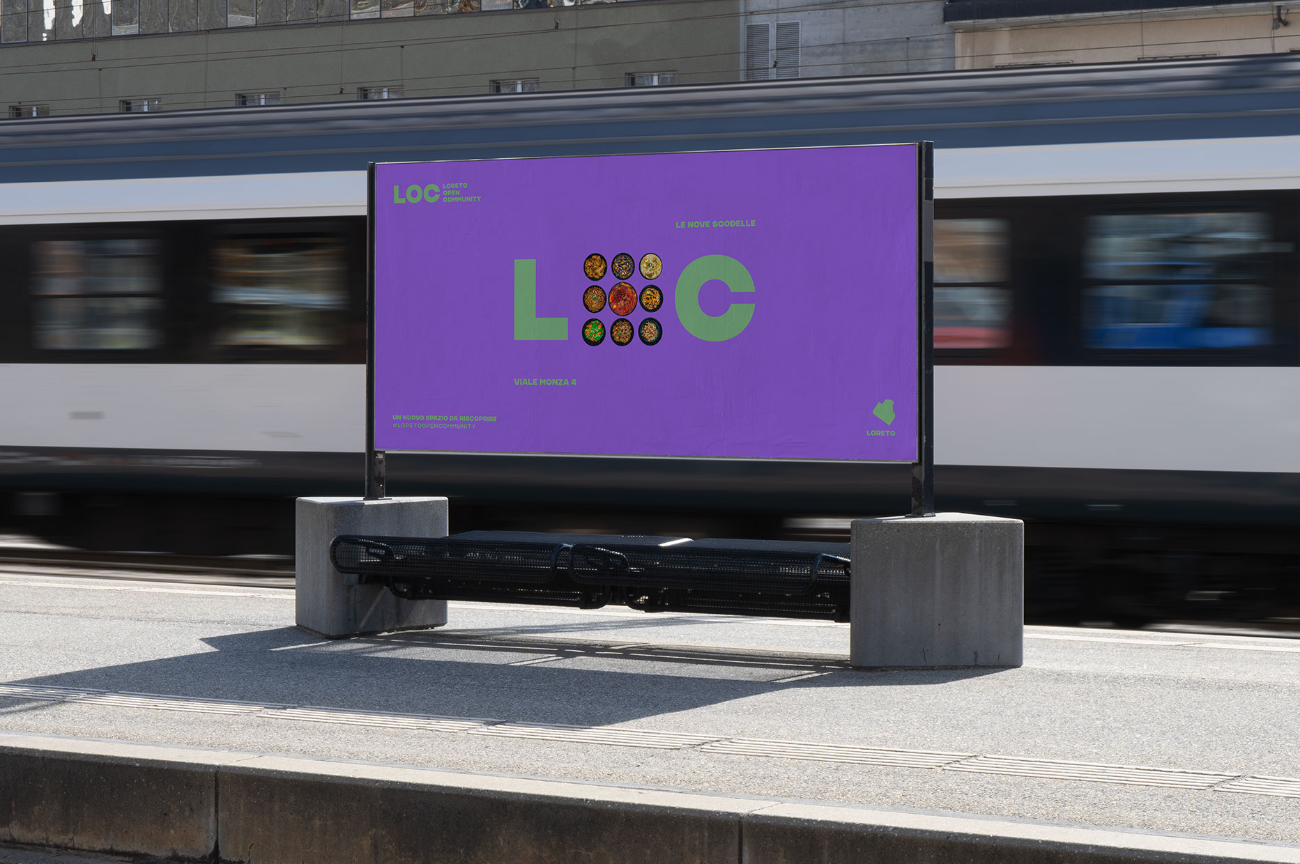
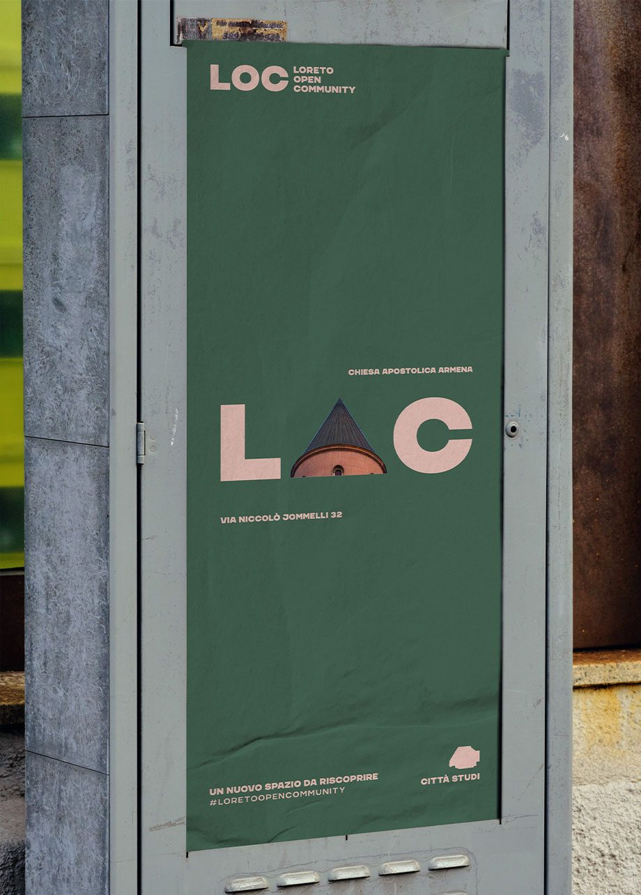

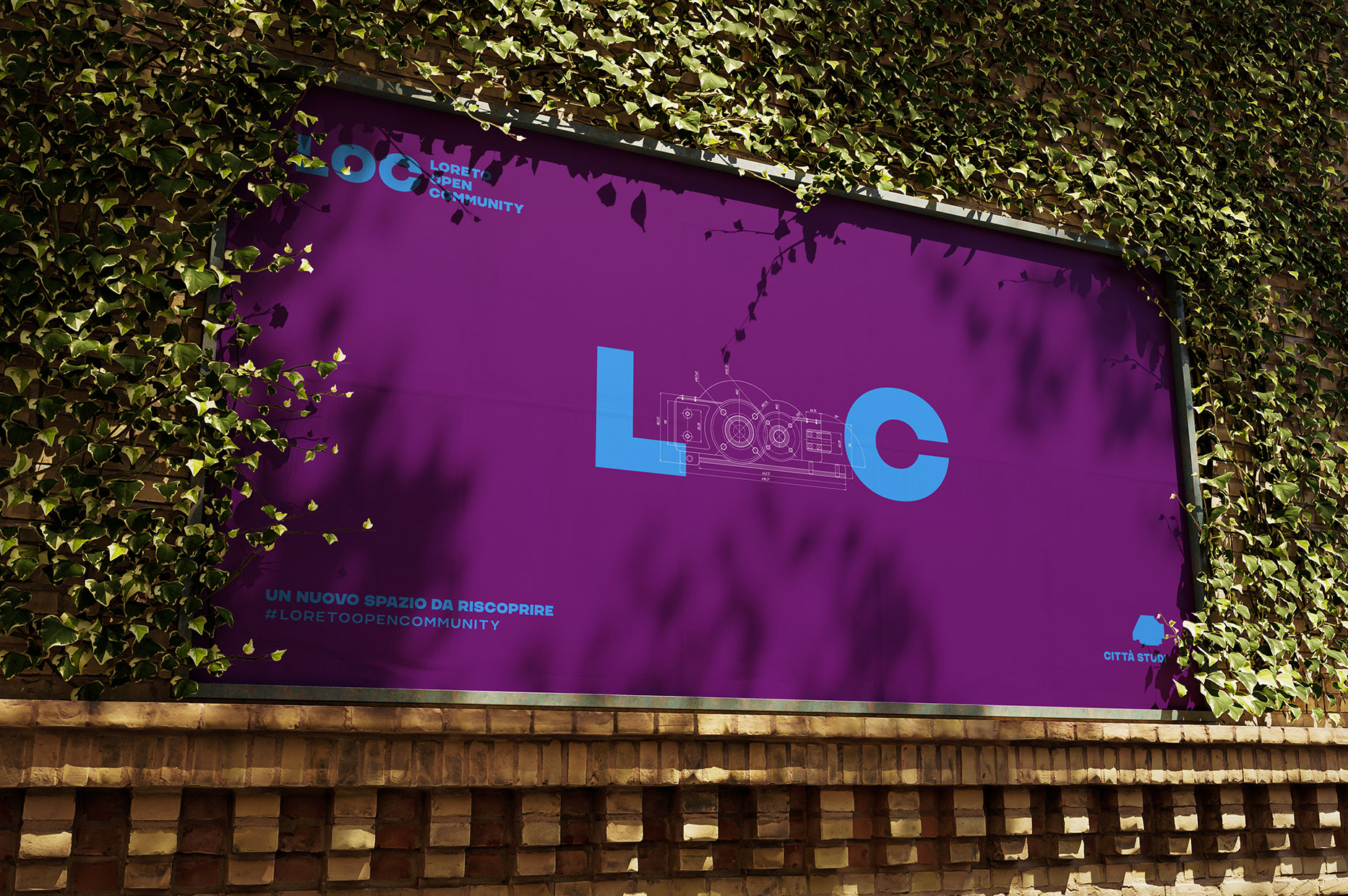
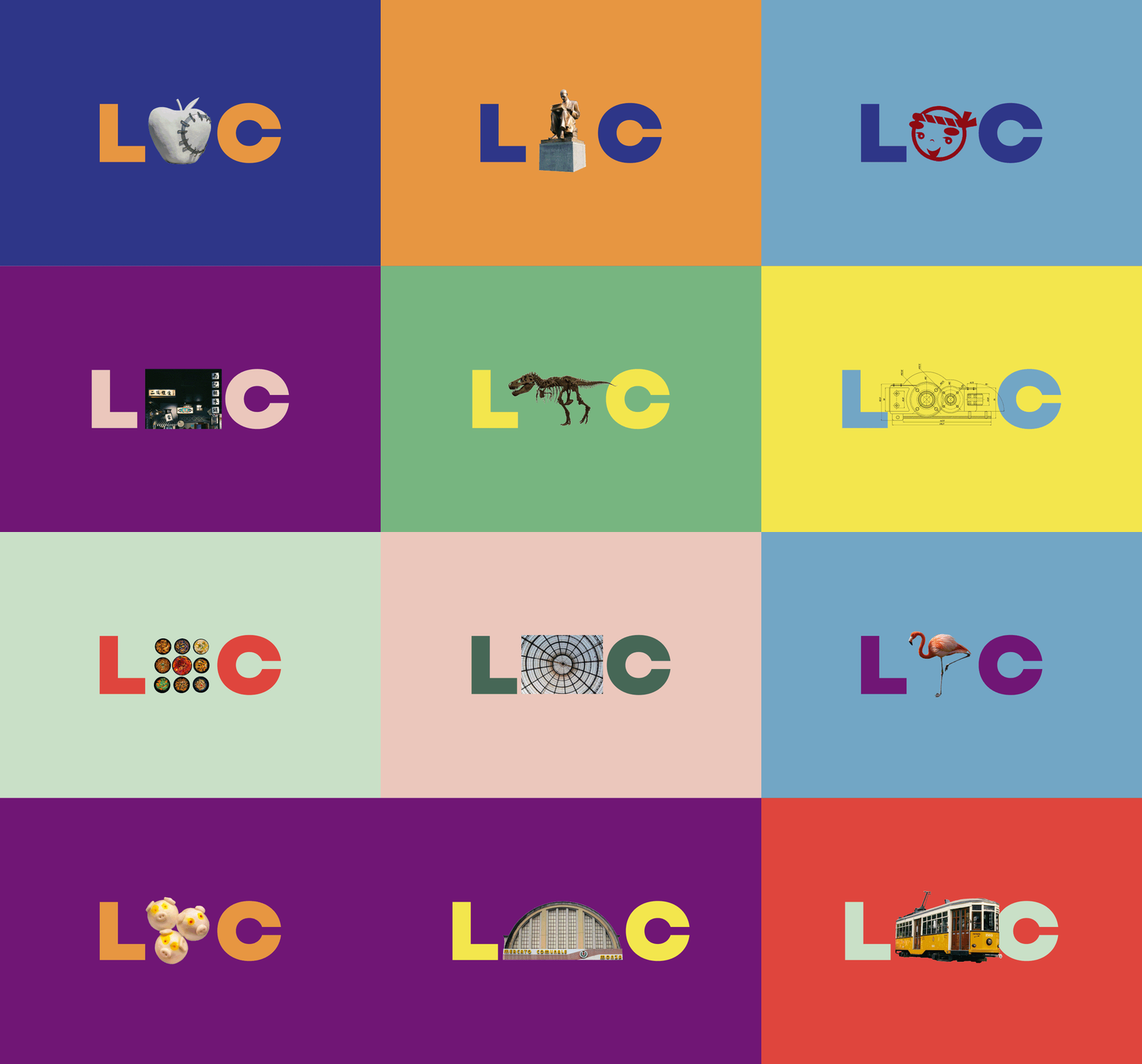
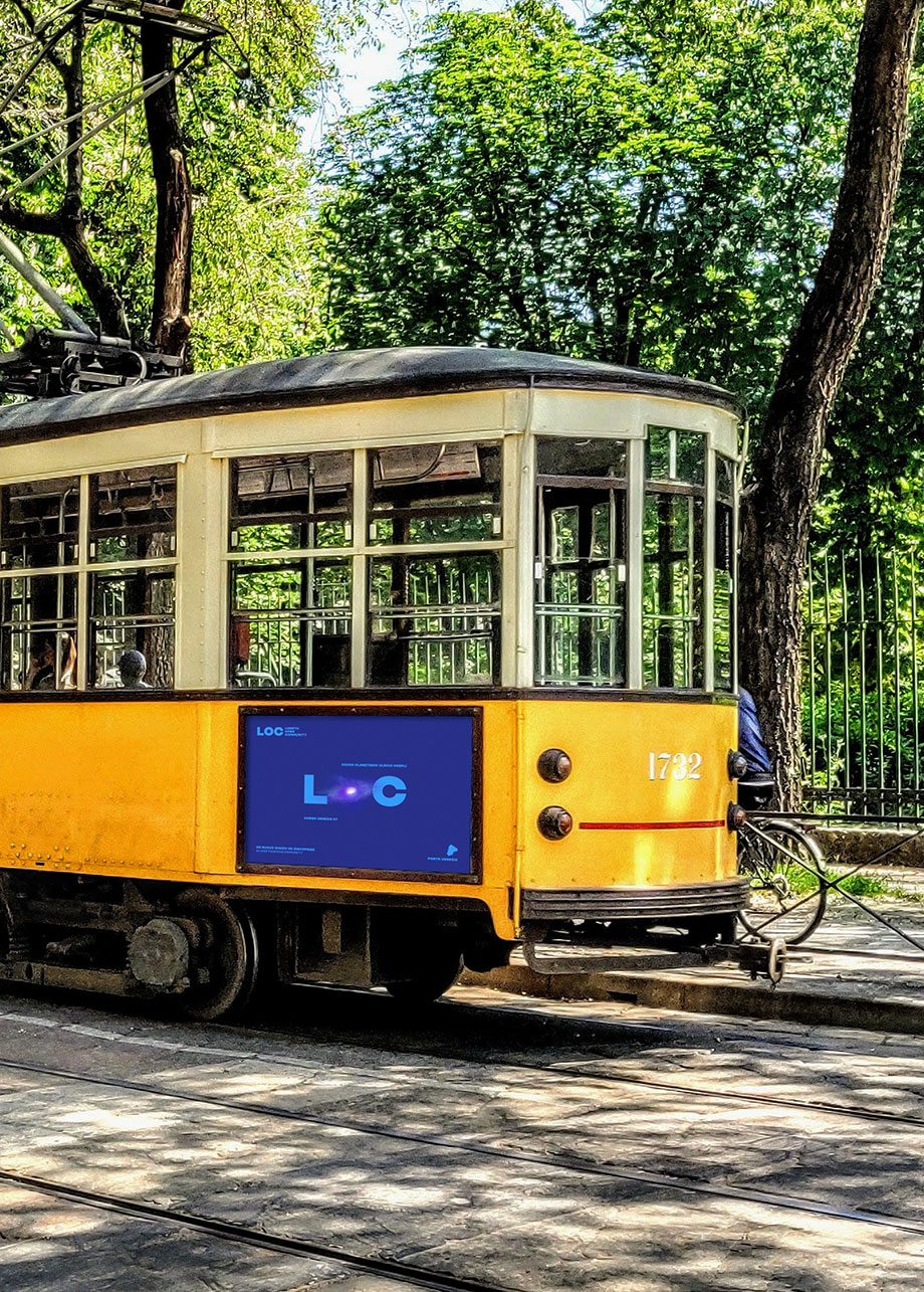
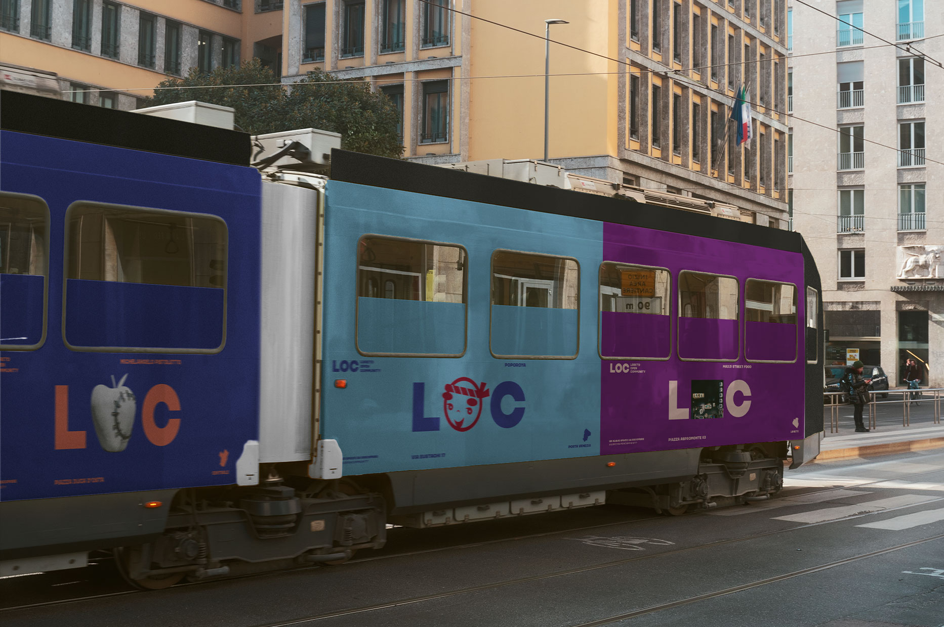

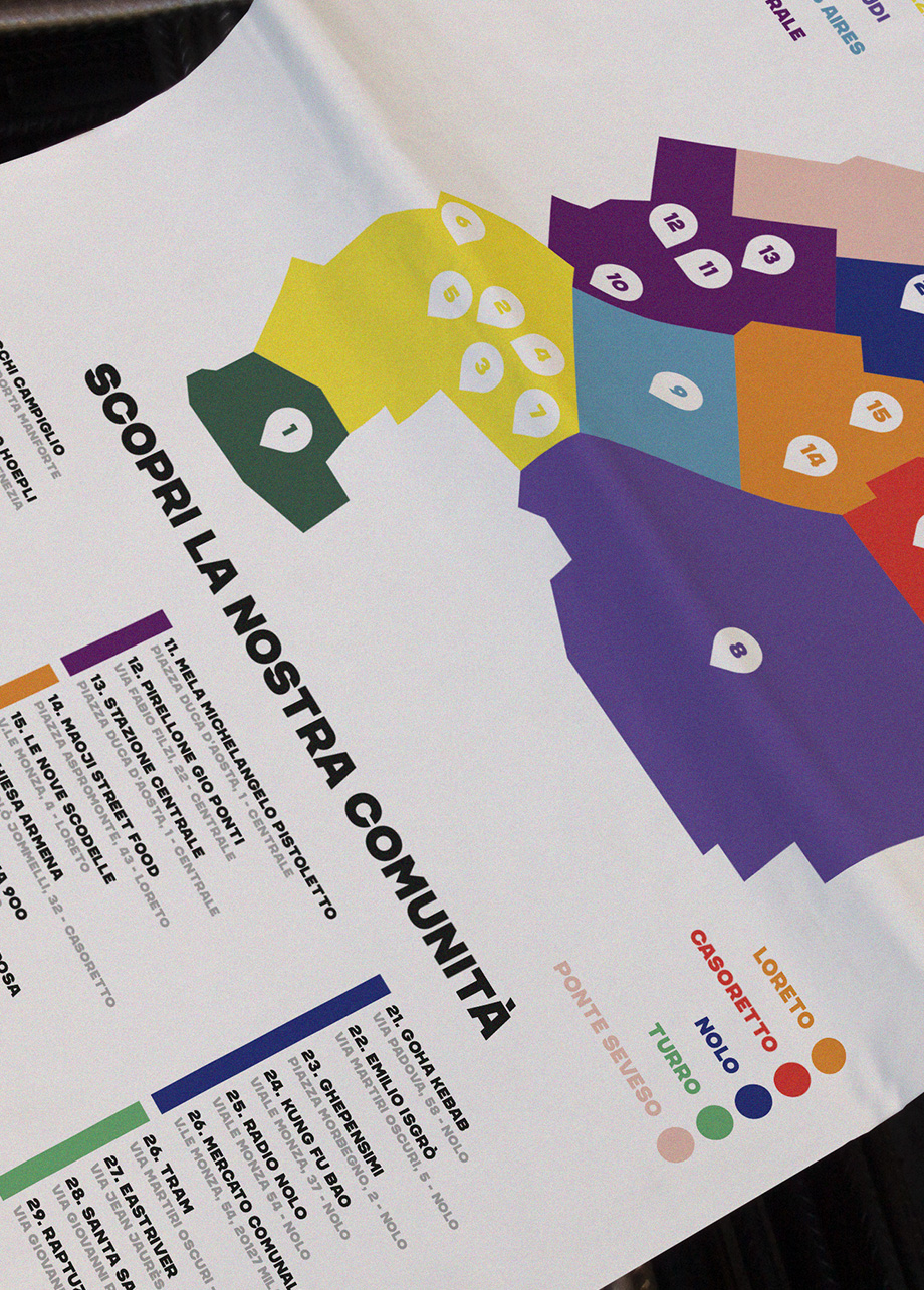
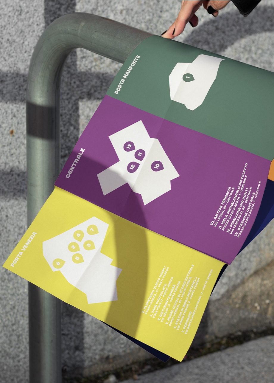
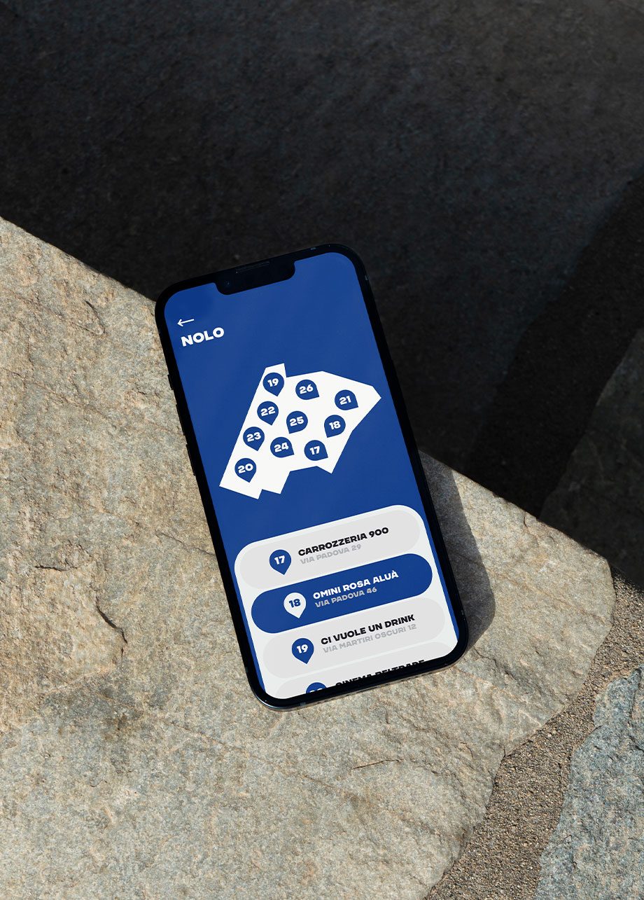
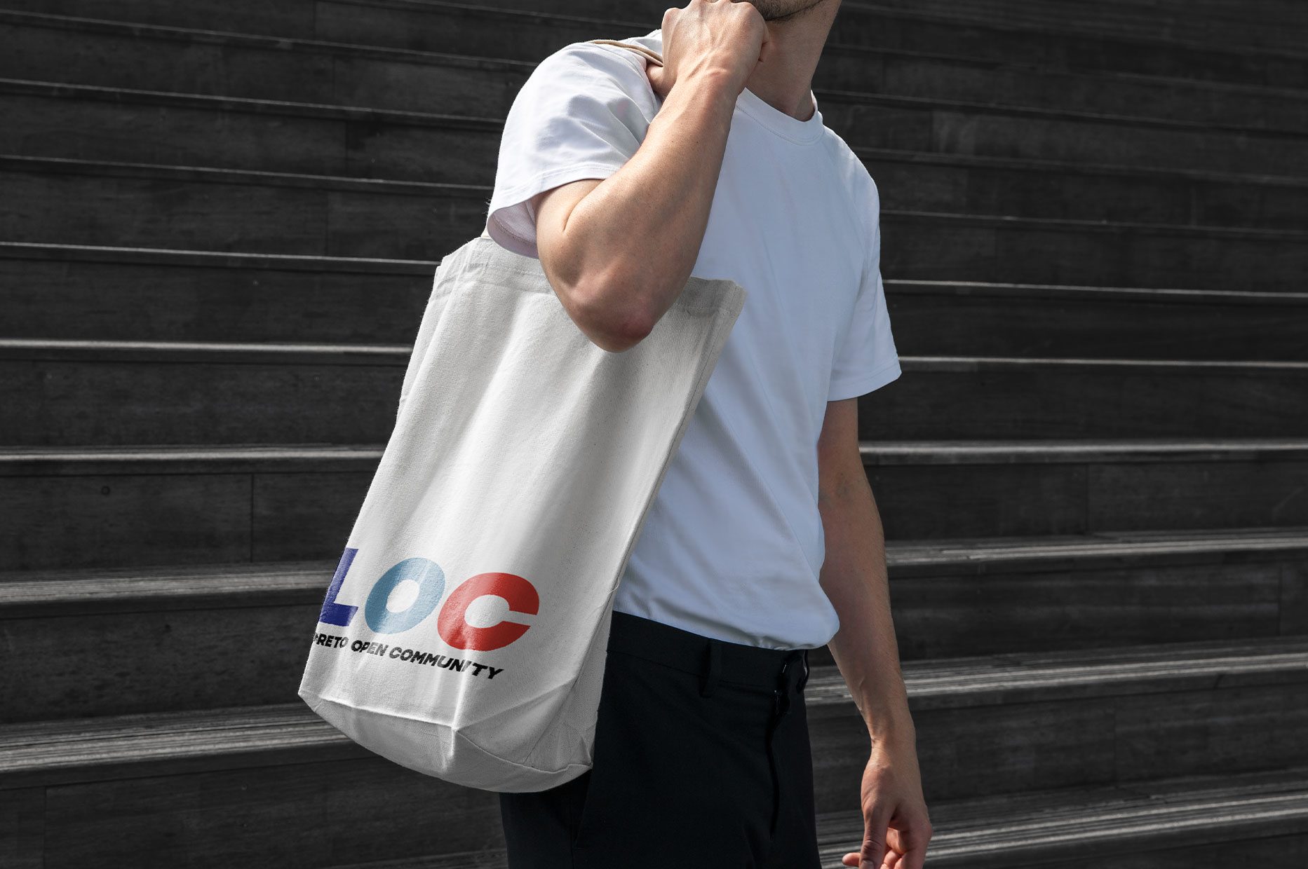
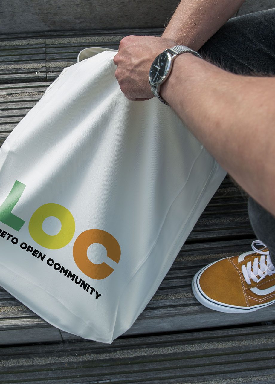
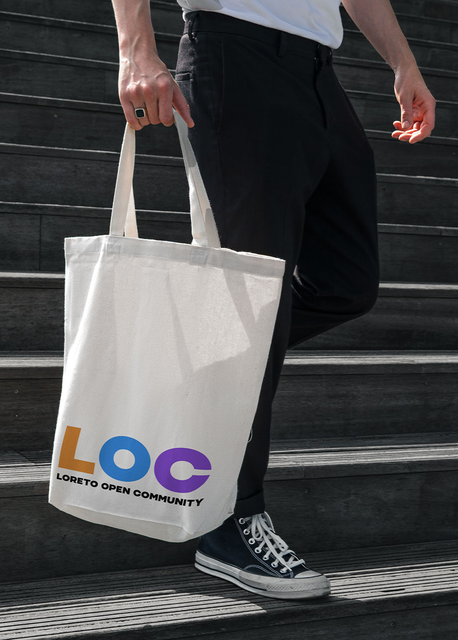
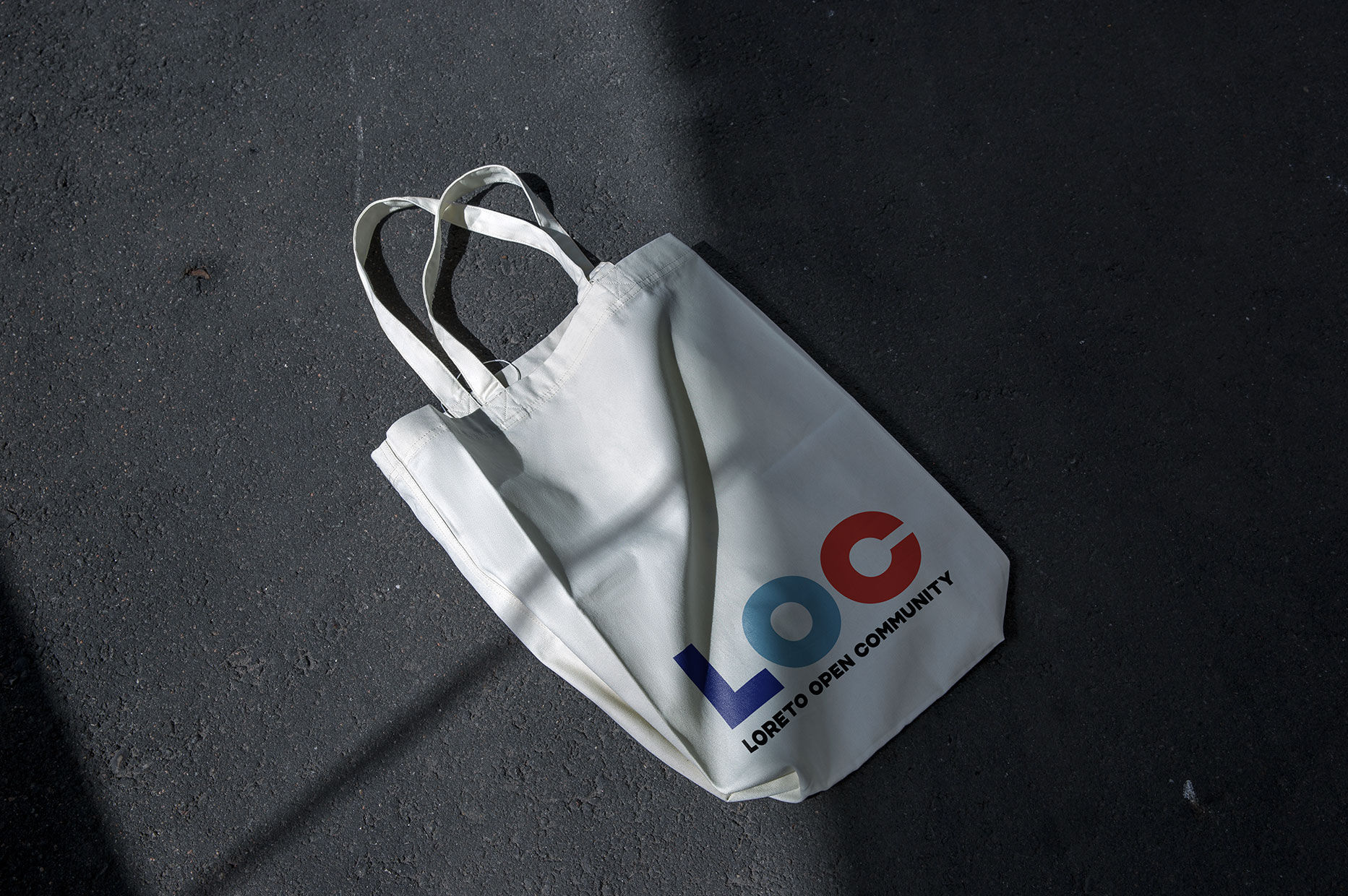
We partecipated at the open call to create a new identity for the community. For the visual language, we chose the most relevant spot in the area based on 6 keywords: art, history, culture, integration, entertainment and design. It comes out with a dynamic brand identity, where all the monuments become part of the logo, replacing the letter O without losing legibility. We support all with a palette of 10 different colours, one for each district in the area, to transmit their soul and make a powerful and playful identity.

