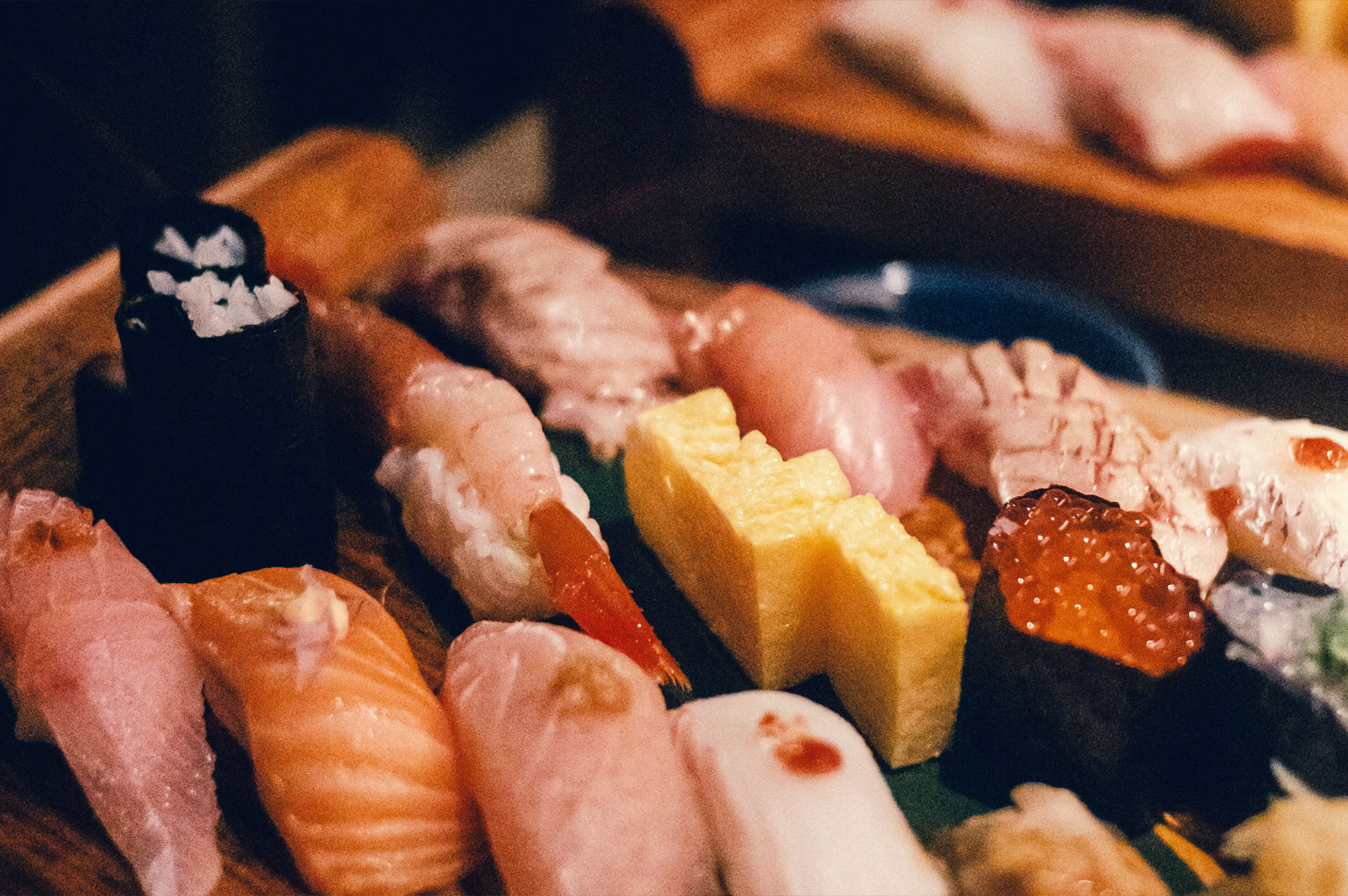
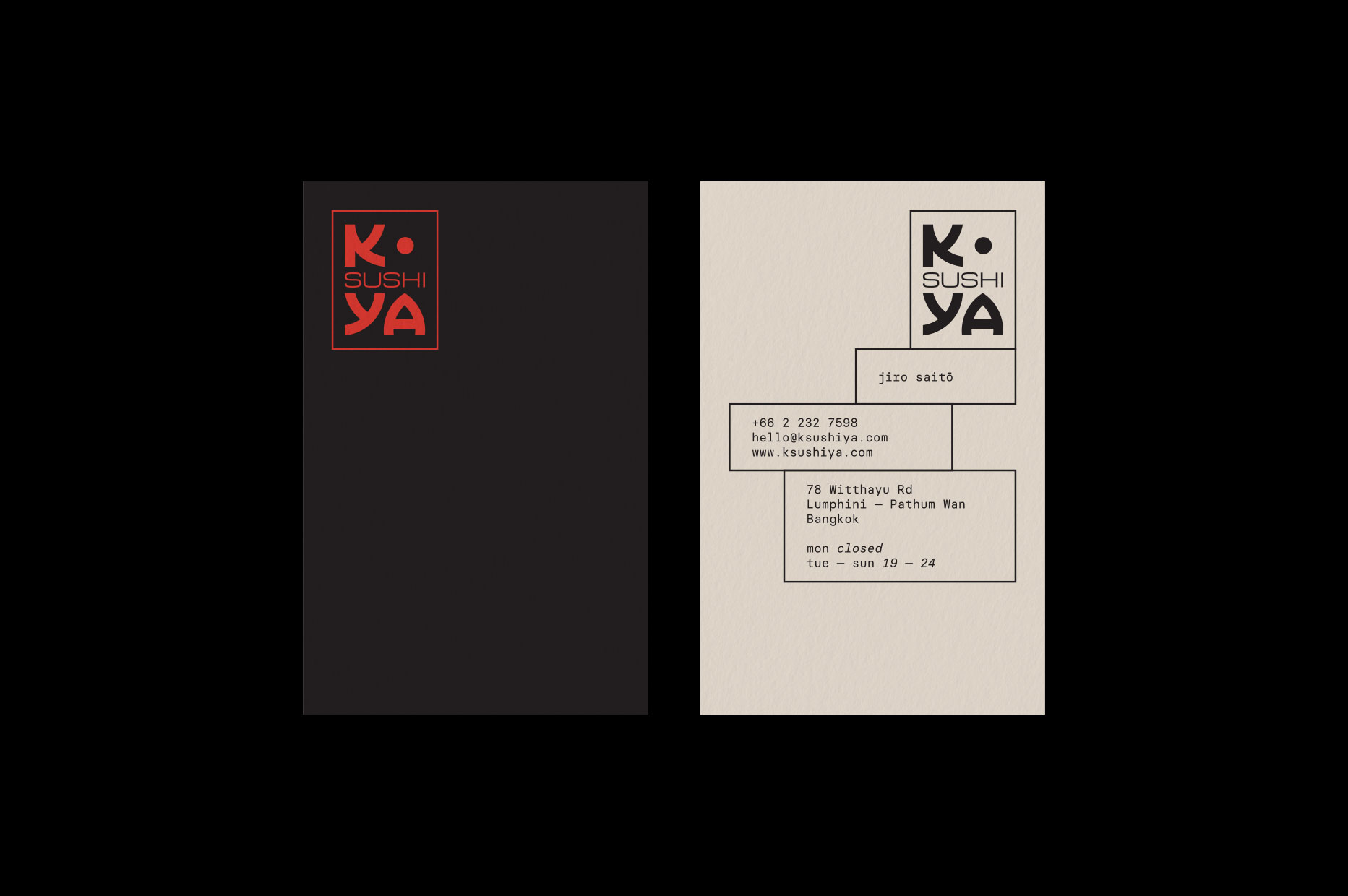
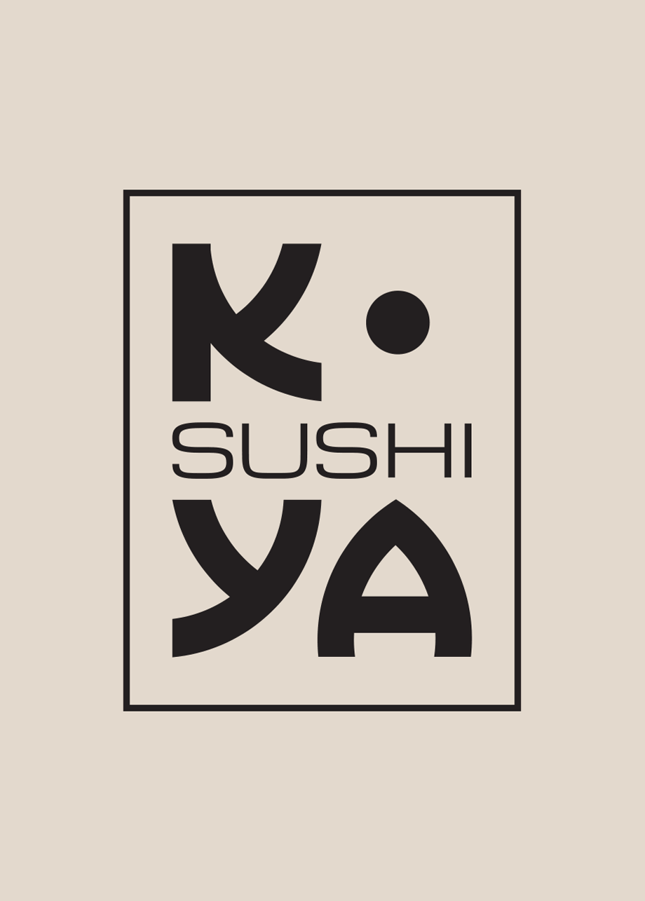
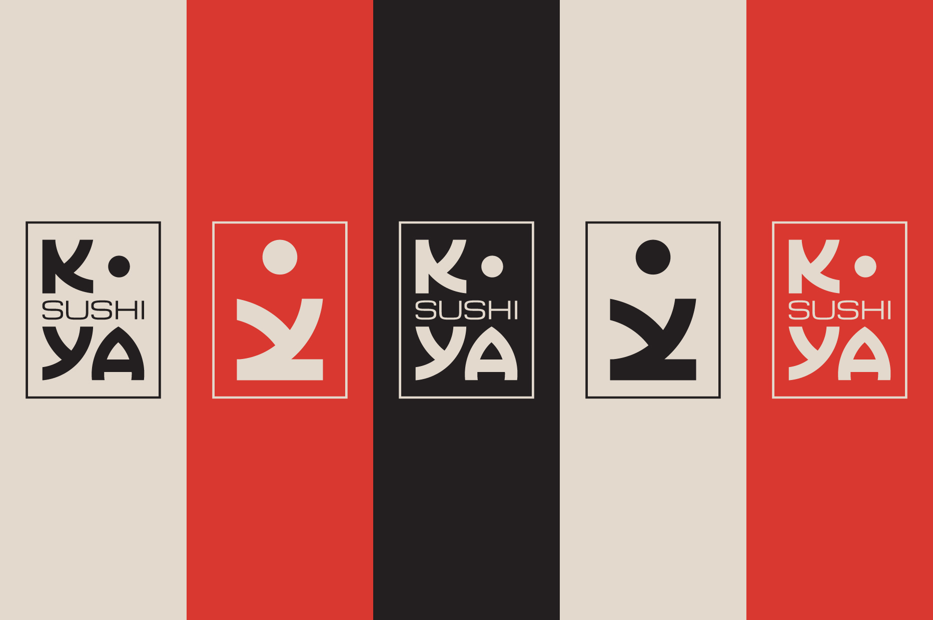
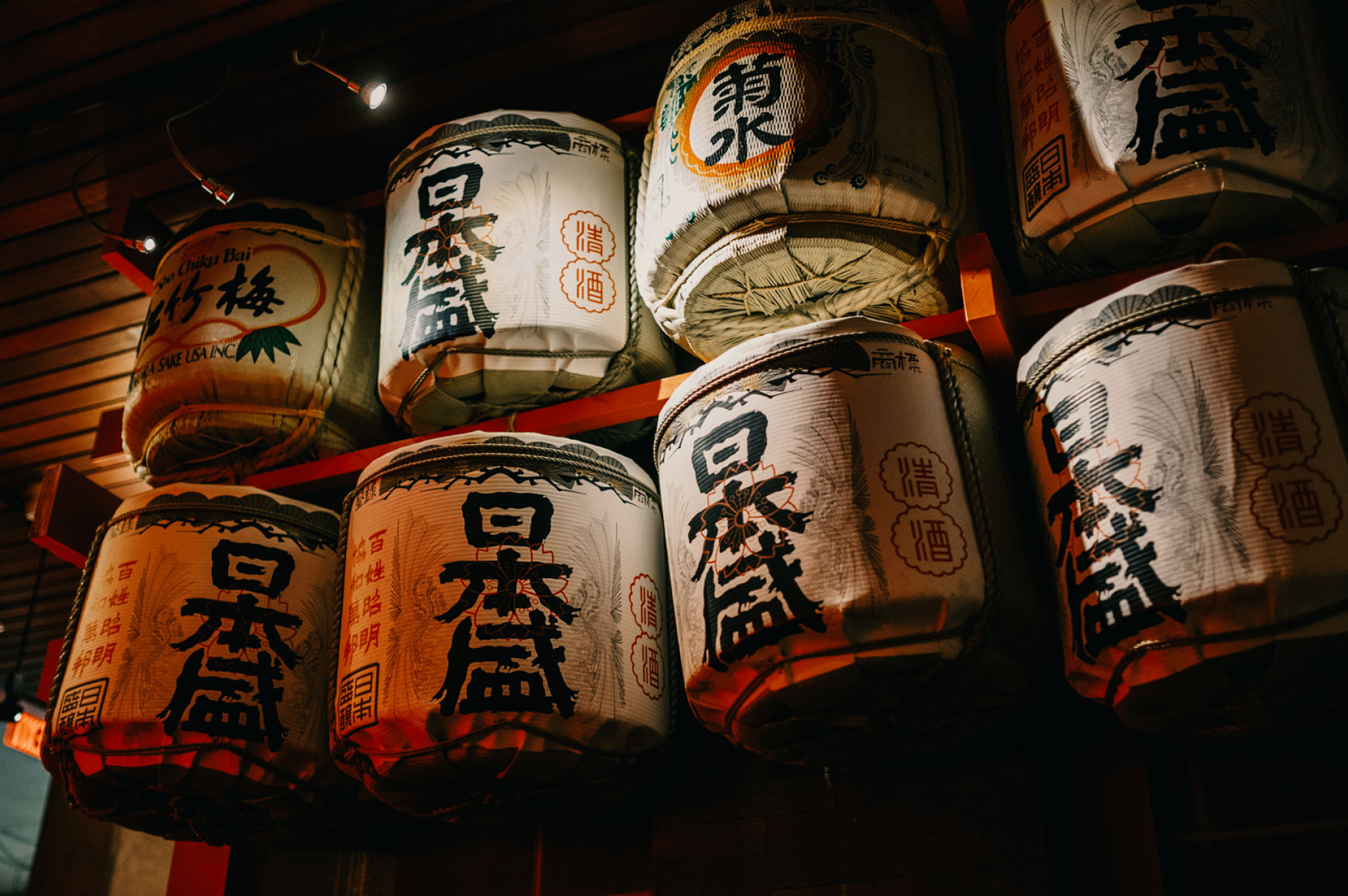
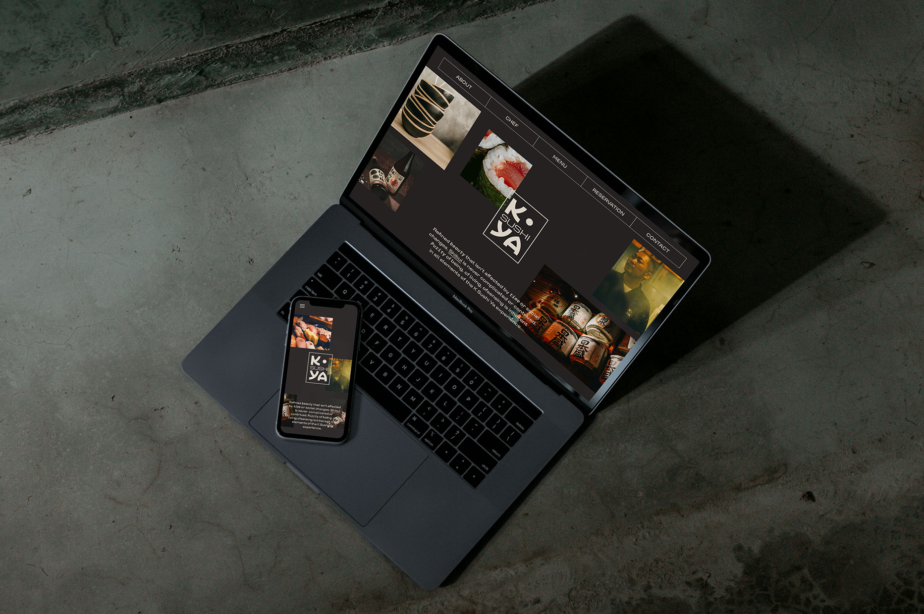
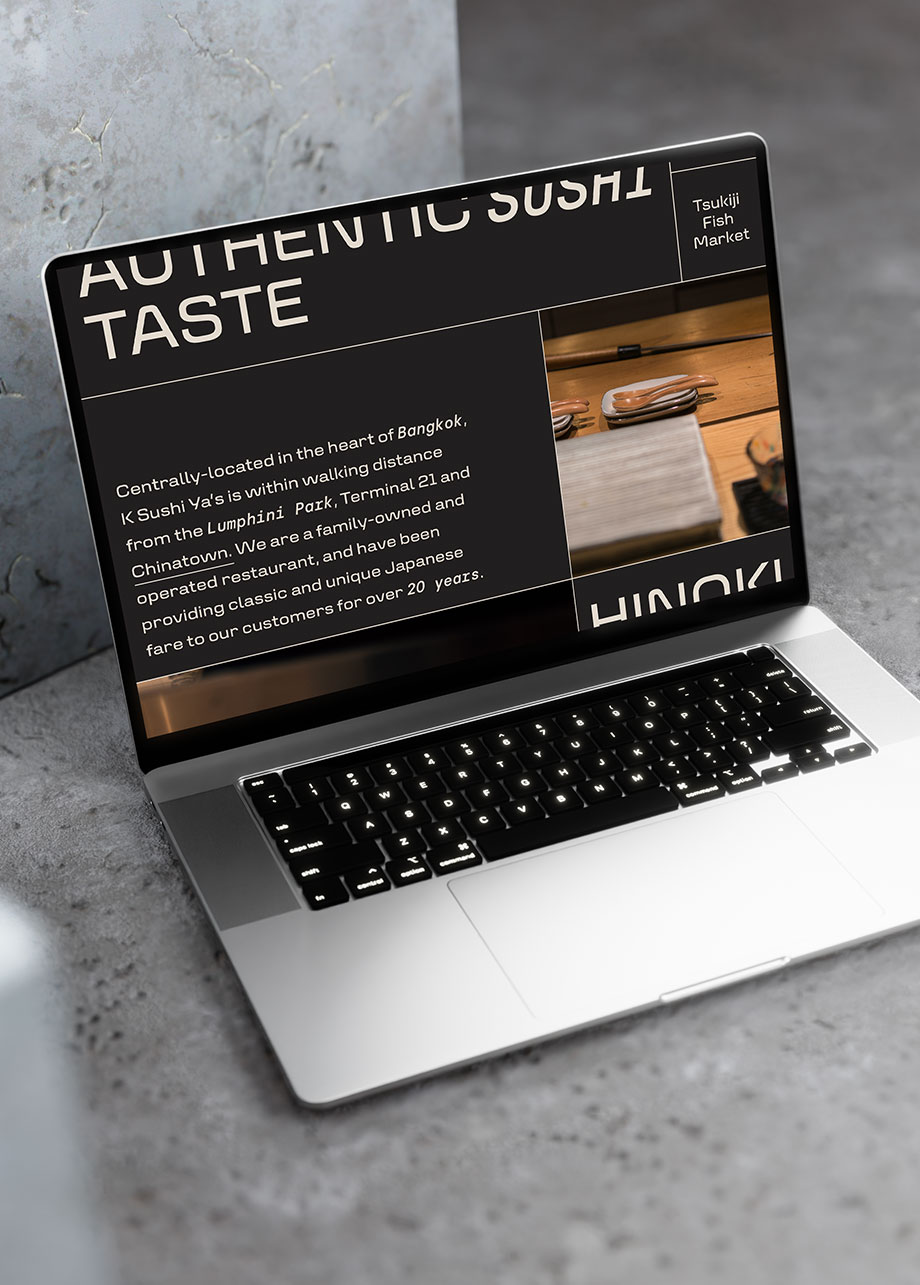
Centrally located in the heart of Bangkok, K Sushi Ya is a family-owned restaurant that offered classic and unique Japanese dishes for over 20 years. The logo framed the word sushi and the letters K Y A, created with a customized typeface inspired by the traditional bowls. The outline shape is used as a modular element to be responsive depending on the content and to design multiple identity elements. The colour palette took inspiration from some of the primary colours of Japanese culture, representing the values of life, authority, strength and prosperity.